Feedback analytics
Focus areas
Navigating ambiguity
Resolving conflicts
Context
As part of the feedback team at Google, I led the design of a new feedback triaging experience aimed at replacing a legacy tool that was obsolete, inefficient, and misaligned with user needs. The project spanned ambiguous problem spaces, shifting organizational priorities, and cross-functional conflict — and ultimately led to a strategic, adoptable solution built with both users and systems in mind.

Orientation - the feedback journey


Listnr
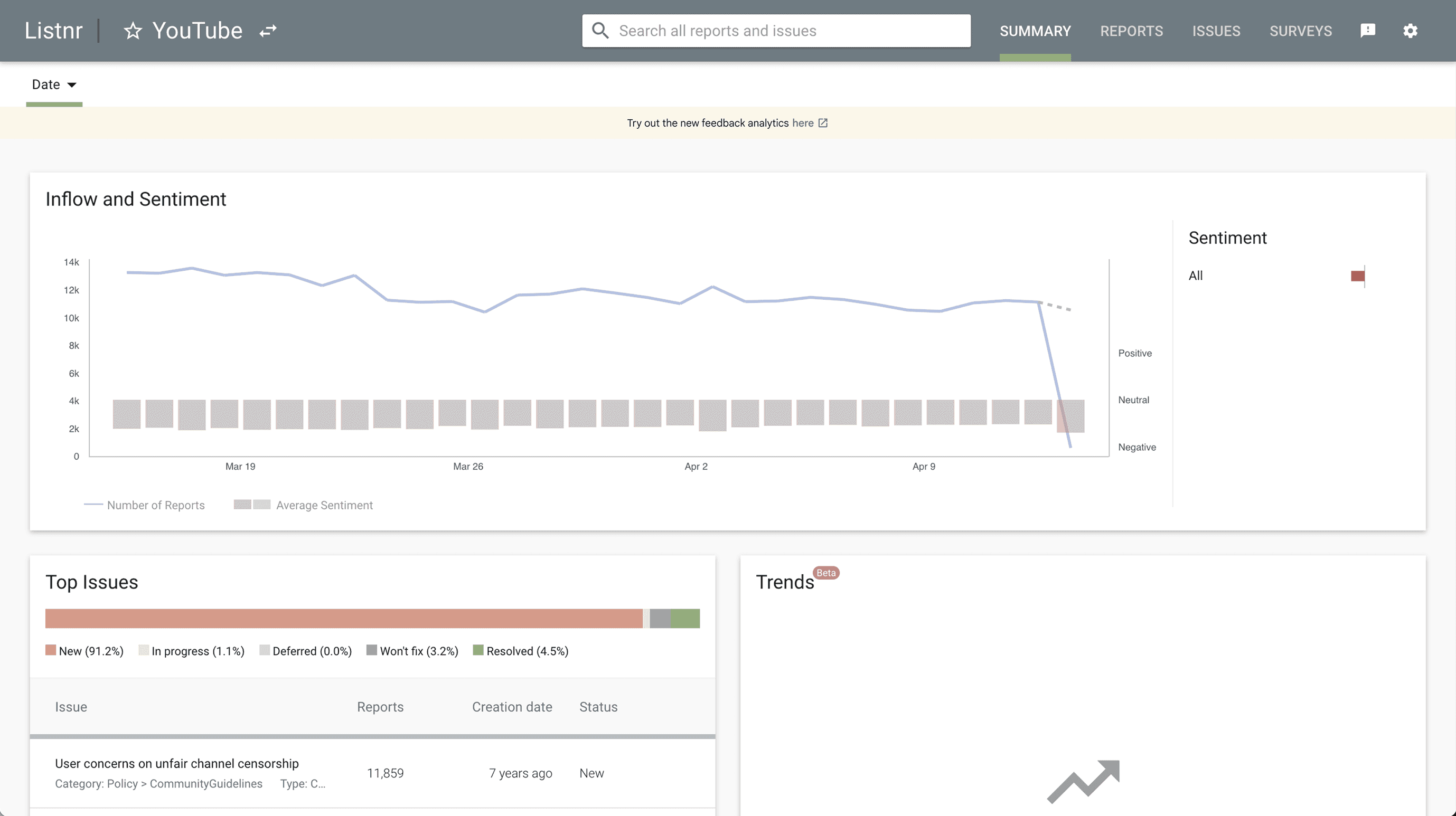
➡️ The existing tool
Listnr is used by multiple product teams at Google to triage and analyze incoming feedback, create bugs, and take action.
It also acted as an entry point for other feedback tools such as the feedback form configurator, close-the-loop email responder and the happiness tracking survey.
However, the tool had several limitations that hindered efficiency and usability.
⚠️ Problems
Built on a soon-to-be-deprecated engineering framework, blocking future upgrades.
Lacked meaningful filters to segment and analyze feedback.
ML tagged issues, but insights still had to be manually uncovered.
Sentiment analysis was misleading, as most feedback was inherently negative.
Fragmented tooling — related features (feedback configurator, ML monitoring, responder email tool) existed in silos, built on modern frameworks.
My role
Navigating ambiguity
As the UX designer on the team, I worked closely with the PM, engineers, and ML researchers to:
Identify user pain points.
Align tool capabilities with stakeholder goals.
Propose a scalable and cohesive information architecture.
Drive the design of a new, unified feedback configuration and triaging platform.
Design brief
Redesign Google’s internal feedback triage tool to unify fragmented workflows, surface actionable insights from ML-tagged reports, and streamline decision-making through a scalable, end-to-end experience.
Guiding principles:
🔸
🔸
🔸
🔸
The new information architecture

ℹ️ Explanation
I designed a new information architecture focused on consolidation and seamless navigation. This involved redefining primary and secondary navigation across existing tools to fit within a unified framework, while introducing new layers of functionality. The approach was well received by cross-functional partners as we moved toward realizing the vision of an integrated feedback platform.
❓ Rationale
Tools like the feedback form configurator, close-the-loop email responder, and happiness tracking survey all existed in silos—each built on a modern tech stack, but disconnected from one another and from Listnr. Product teams frequently had to switch between these surfaces, resulting in friction, context loss, and a fragmented workflow. I saw this as an opportunity to propose a unified experience that would streamline these interactions and reduce fragmentation.
Listnr 2.0
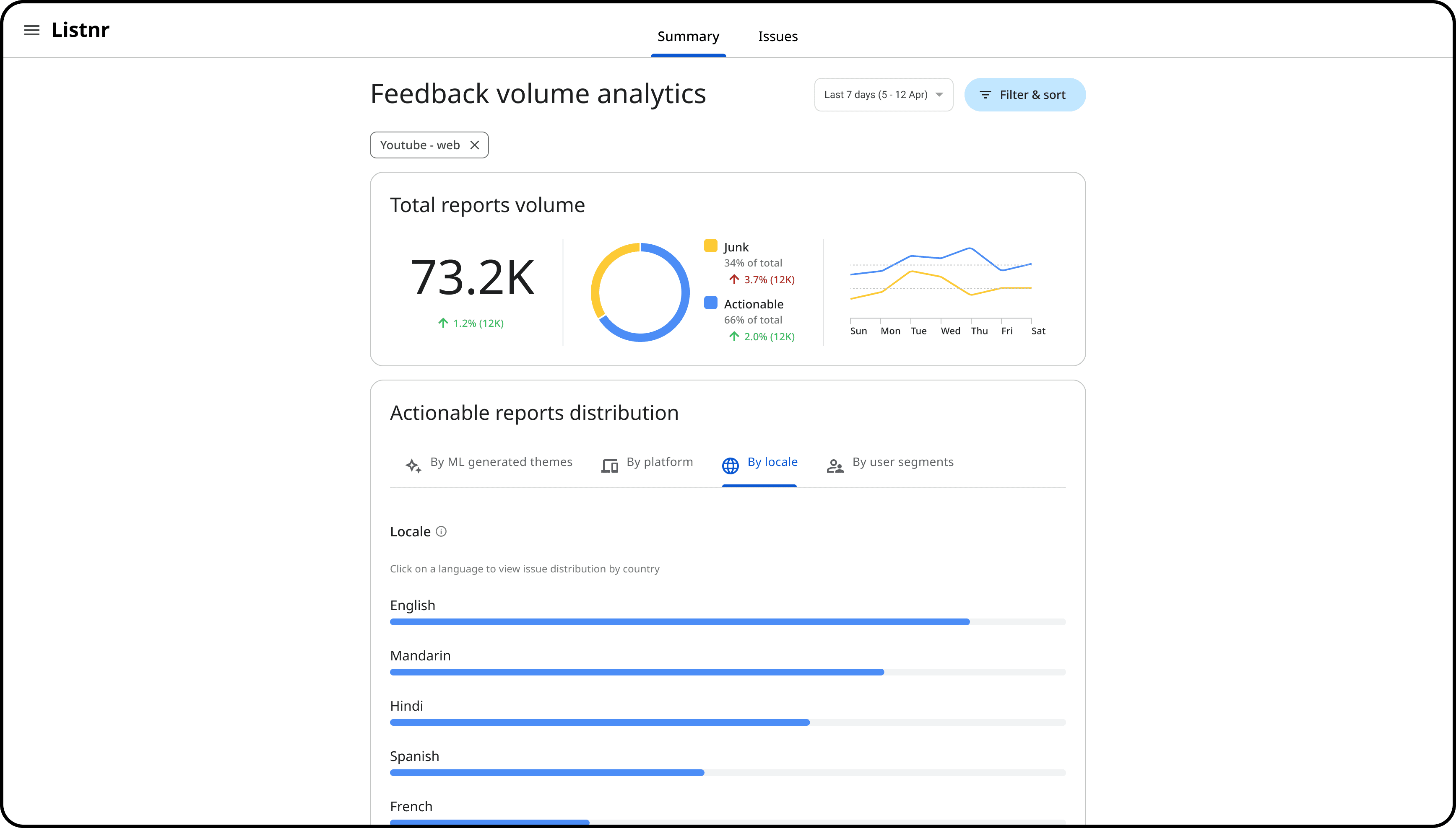
1️⃣ Landing page
The new landing page presented overall feedback volume within a selected date range, categorizing it into actionable vs. junk feedback. Historical data was layered in to help teams identify spikes and anomalies over time.
Actionable reports could then be further explored using filters such as ML-generated themes, platform, locale, and user segments—enabling more targeted analysis and prioritization.
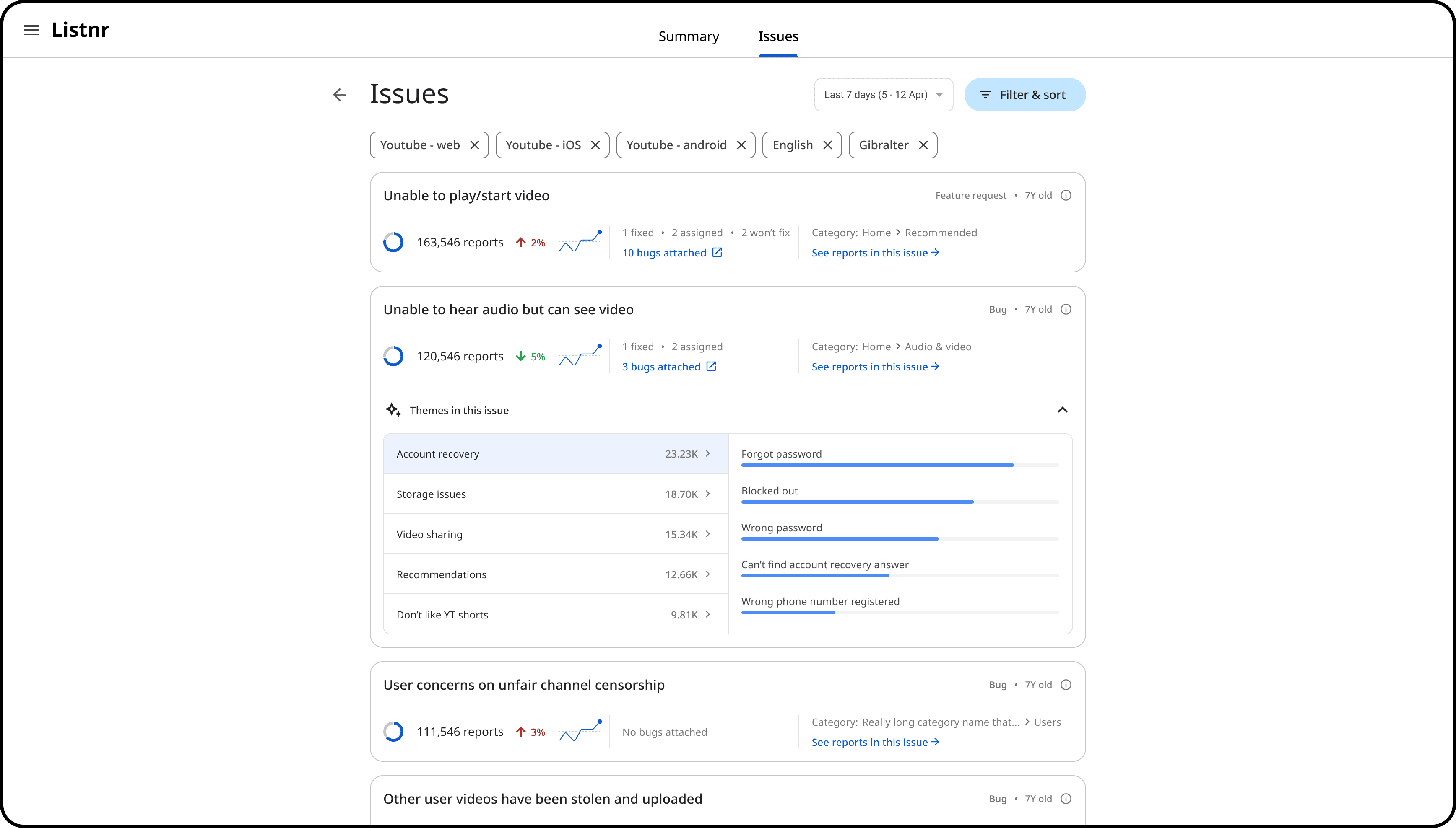
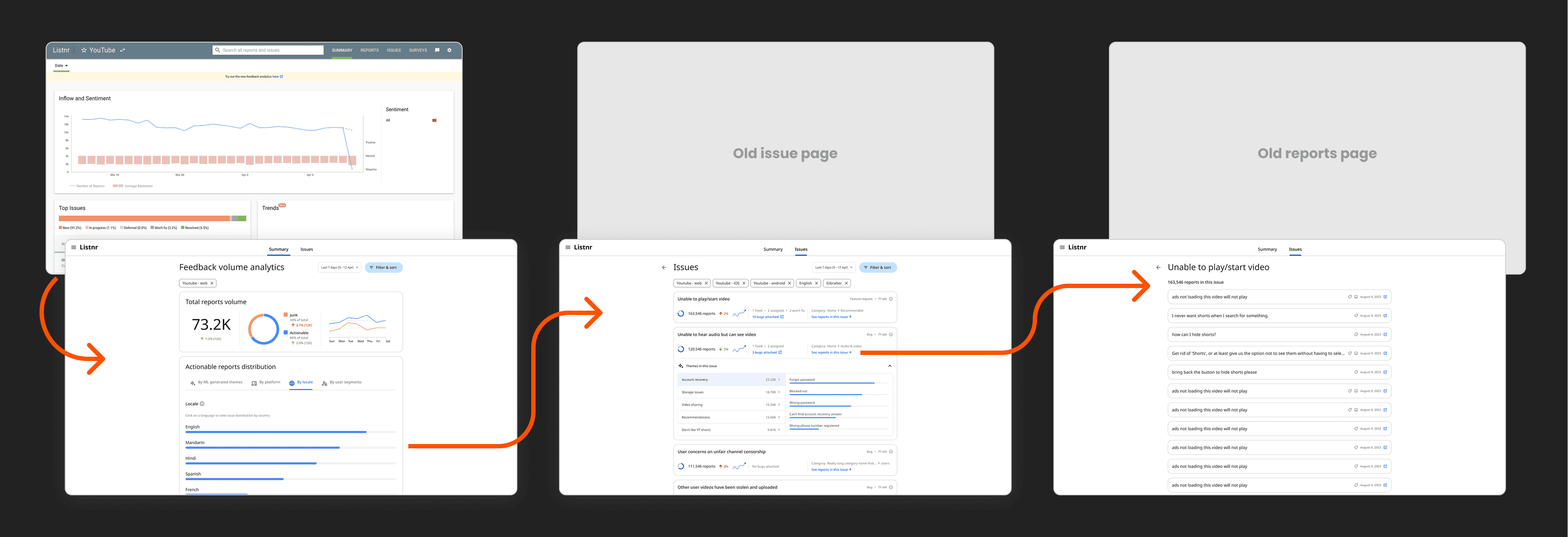
2️⃣ Issues page
The new Issues page could be accessed either through the primary navigation or by drilling down directly from a chart on the landing page. It introduced advanced filtering, improved visualizations, and AI-generated themes to support deeper exploration and faster prioritization.
Engineering recommendation
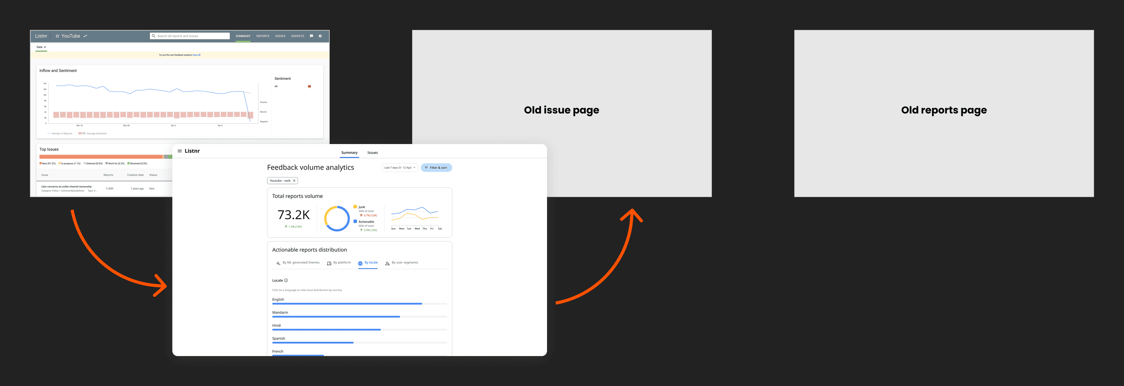
ℹ️ Explanation
Engineering proposed linking the new landing page to the legacy dashboard, allowing users to see high-level metrics in the new UI before switching to the old system for deeper exploration—aiming to reuse completed work without expanding scope.
❓ Rationale
Given the org-wide reprioritization, this was a practical compromise—allowing the team to ship partial value, preserve completed work, and minimize engineering effort without committing to a full migration.
PM recommendation
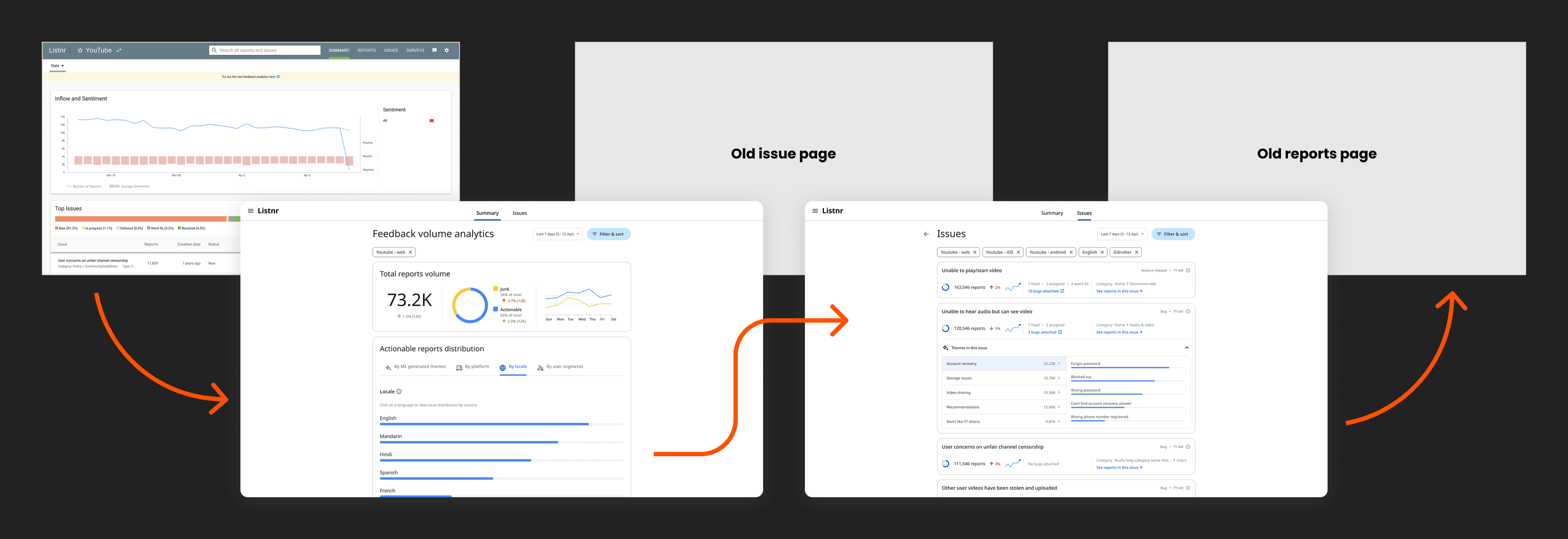
ℹ️ Explanation
The PM proposed supporting limited drill-down functionality by including the newly designed Issues List page. In this approach, users could begin with the new landing page, drill into categorized issue lists, and then transition to the legacy system for deeper report-level actions.
❓ Rationale
This approach preserved a key part of the new experience while enabling granular filters for targeted analysis—aimed at improving usability and encouraging adoption within limited scope and resources.
My role - user advocacy
Resolving conflicts

ℹ️ Explanation
I highlighted that both fallback options would result in a disjointed experience—starting with a modern UI but dropping users into the outdated system. To avoid this, I proposed a lightweight Reports page to complete the triage flow within the new interface.
❓ Rationale
This preserved continuity without adding major tech overhead and made the experience feel complete. It increased the likelihood of adoption and was ultimately agreed upon after several rounds of stakeholder alignment.
Outcome
The final product included all three views — Landing Page → Issues List → Lightweight Reports — allowing a smooth, self-contained user journey.
Adopted by 2+ product teams.
Sparked interest in broader adoption and future iterations.
Tamal Patra 2026