Voice typing
Focus areas
Interaction design
User research
Collaboration
Context
Google Feedback is a core primitive used across products to let users report issues and share ideas. However, after analyzing large volumes of feedback, we found that users were also using it to seek help, vent frustrations, or just type gibberish—causing valuable insights to get lost in the noise. We took a step back to rethink the end-to-end feedback journey with the following goals:
Empower teams to configure feedback intake based on their product context.
Reduce junk volume by helping users articulate better and redirecting them to appropriate channels.
Enable teams with AI-powered theme detection and channels for user updates when issues are resolved.
Acknowledge user effort to encourage better feedback over time.

Orientation - the feedback journey


Hypothesis
UX-PM collaboration
Research revealed that up to 40% of users in some NBU (Next Billion Users) countries are semi- to non-literate, and typing in local languages can be a major barrier—especially for NIU (Novice Internet Users) unfamiliar with standard keyboards.
UX and PM jointly hypothesized that introducing voice input could help these users share clearer, more useful feedback. Instead of jumping to solutions, I proposed a lightweight experiment using built-in speech-to-text features already available in most smartphone keyboards to quickly test this assumption.

Validation
The experiment outcomes were promising:
The experiment group exposed to the speech to text feature, showed a decline in volume of junk feedback reports by ~2% from 57,315 (56.86%) of 100,800 total volume to 40,548 (54.65%) of 74,192 total volume over the course of 1 month.
The experiment group submission rate improved marginally to 11.82% as compared to control group at 11.53%.
~2% more feedback could be categorized using our pre-defined issue tags.
However, there was a caveat with this approach - the location of the default microphone button varied with the device manufacturers and their respective UIs. This reaffirmed the need to design a consistent experience.

Design brief
Design a dedicated voice typing feature that’s consistent across devices and easy to discover so that users can give us better feedback.
Guiding principles:
🔸
🔸
Ease of discovery.
🔸
Exploration 1 - user selects input type

➡️ Steps
Select modality (type/speak).
On selecting 'Speak', the mic is activated and the keyboard is replaced by the listening screen. The user can speak their issue and see it get transcribed in the text input field.
The user can switch back to text mode.
Make final edits.
Submit the feedback.
✅ Pros
Easy to discover as it’s integrated into the flow of the conversation. #discoverability
Can adapt to user behavior over time. Based on past preferences, UI can default to either ‘Type’ or ‘Speak’.
⛔ Cons
Adds an extra step to the core flow.
User needs to switch between modalities to be able to make edits to the transcription.
Requires higher engineering effort.
Requires modifications to the core flow.
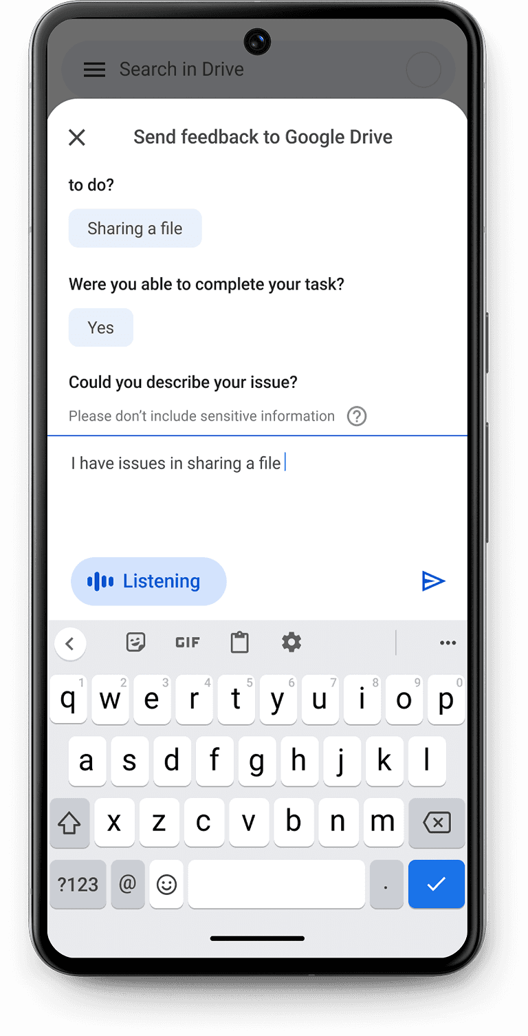
Exploration 2 - the morphing button

➡️ Steps
Type right away or choose to speak.
Describe the issue using voice, see it get transcribed in the text input field directly.
Make edits to the transcript.
Submit the feedback.
✅ Pros
Users can dictate and edit the transcript simultaneously without having to switch between modalities. #flexibility
Minimal distraction from the core flow. #familiarity
⛔ Cons
Adoption might be impacted as users will have the natural tendency to type when the keyboard is open.
Exploration 3 - the dictation screen

➡️ Steps
Type right away or choose to speak.
Describe the issue using voice in the dedicated dictation screen.
Exit dictation screen.
Edit the transcript.
Submit the feedback.
✅ Pros
Dedicated dictation screen makes it easier to focus on the transcript with larger text.
⛔ Cons
Distracts from the core flow.
Ambiguity around the next step - will it submit the feedback directly or will the user have the option to edit?
Tamal Patra 2026